I was originally going to write a post about our first month on solar power, but I got so into the depths of explaining how to read the graphs on the Tesla app that I figured I would just do a post all about that first! So, click on in for some examples of our solar usage and how to analyze them via the Tesla app.
Here’s our electricity usage for a recent day that we had the A/C on:
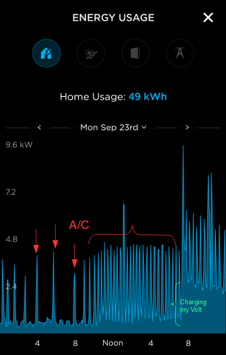
The horizontal axis is the progression of time throughout the day — the labels across the bottom are 4:00 AM, 8:00 AM, Noon, 4:00 PM and 8:00 PM. (The left edge is midnight that morning and the right edge is 11:59 PM that night.) The vertical axis is kilowatts of power. In the graph above, the only thing showing is Home Usage (blue) so this is a graph of how many kilowatts our home was using at various times throughout the day. The horizontal resolution is 10 minutes, so a spike means that amount of power was used within those 10 minutes.
As you can see from the labels I’ve added, the night was fairly cool so the A/C only kicked in every hour or two. As the morning wore on, however, the temperature rose and the A/C started kicking in much more often. You can see how much power that consumed on this day compared to the “base level” going across the bottom (which we believe is our refrigerators / freezer, attic fan and “vampire power” from all our devices that are in standby). You can also see the “base level” jump up a lot around 7:30 PM; that’s because I worked late that day and when I got home I plugged in my Chevy Volt to charge, which draws a continuous 2 kW or so until it’s topped off. (I’m still using the 110v portable charger that came with the car so it seems to draw 2kW over a period of about 8 hours; once I get off my butt and get an electrician out to install the 240v car charger I bought this power draw will probably change to something like 4kW over the course of 4 hours instead.)
For comparison, here’s a nice day we had recently where we opened the windows and left the A/C turned off:
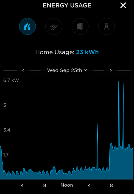
As you can see there, the power usage hung around that nice low “base level” for most of the day until I plugged my car in (I worked late again). The spike around 5:00 PM is when my wife used the stove and the spikes around 9:00 and 10:00 are the water heater turning on its heating element to replenish the hot water supply after we used some to wash dishes and take showers respectively.
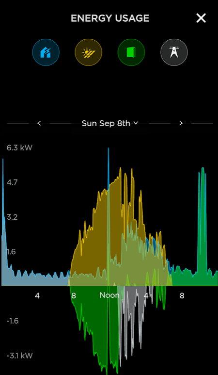
Now let’s make this graph a bit more interesting! You’re probably thinking “That’s great, you can see what power you used — but we’re here to hear about your solar power!” Well, let’s overlay the solar production and grid usage on the above “nice day” graph:
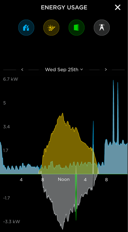
Whoa! That’s a kinda busy graph! Let me break it down for you.
The icons across the top, in addition to being buttons I can use to toggle what gets displayed on the graph, are a legend. The blue house is home usage (which you were seeing before), the yellow sun on panels is solar production (how many kW of power the solar arrays are producing at any given moment), the green slab is our PowerWall batteries (how many kW of power are going into or coming out of our batteries at any given moment) and the gray powerline is the power grid (how many kW of power are going into or coming out of the grid at any given moment).

The solar production (yellow) is fairly obvious. When the sun rose around 7 AM the tiles started producing a little bit of power, and as the sun continued to rise they produced more and more due to the angle penetrating straight into the tile instead of glancing off and due to the sun hitting both slopes of our roof. (It rises on one side of our house and sets on the other, which is the least ideal orientation — for certain portions of the day only half the tiles are in the sun. If our house were facing north or south the graph probably wouldn’t be so “pointy.”)

Next the green for the PowerWalls. Your eyes aren’t deceiving you; they only show up on this graph once, at around 2 PM. Because the graph is below the zero line, that means we’re putting power into them as opposed to taking power out of them. Why are they only on there once? That’s because we’ve got them set to “Backup Only mode” — they don’t provide power to the house unless the grid experiences a power outage. I’ll explain why we’ve got them set that way in a whole other post; in short the way our utility does Net Metering there’s no cost benefit to using the batteries to store and retrieve solar power, and the research I’ve done comes back mixed on which way provides better environmental impact. This took us a little while to realize and at first my wife and I debated about it so it deserves a dedicated writeup for those considering a solar power system.

Now for the most interesting part of this: The gray line for the power we’re putting into and out of the grid. In the leftmost quarter of the graph, before the sun comes up, what looks like a pale blue is actually the gray “grid” line exactly matching up with the blue “home usage” line. In other words, every kilowatt we used was pulled from the grid and we didn’t pull any more or less. Once the sun comes up, though, you can see the gray separate from the blue and head underneath the zero line and become more or less a mirror image of the yellow solar line. That’s because the solar array is producing more power than we’re using and the excess is being sent back into the grid. If you notice, at 5:00 PM when the stove is on there’s a notch in the gray under the graph; the home usage was greater than the solar production so we drew power from the grid to make up the difference, hence we weren’t sending any power into the grid for a few minutes.
So, overall this was a pretty darn good day for our solar installation! Here’s the summary the app gives for that day:
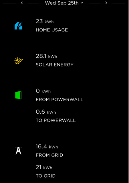
Basically, we produced 28.1 kWh while the sun was up but we only used 23.6 kWh throughout the entire day (including topping off the batteries at one point) so at the end of the day we made a “profit” of 4.6 kWh. The dynamo at the power plant spun just a little slower that day because some customer somewhere used the power we generated on our roof. Meanwhile, the next day when we turned on the A/C and sucked power out of the grid the first 4.6 kWh was free.
Indeed, here’s the “Impact” screen the Tesla app provides.

According to this view, we negated our electrical impact on the environment plus 22% on top of that. In other words, we had zero impact and assuming our neighbor used the same amount of power as we did that day, and assuming the power we sent into the grid went straight next door, we would have offset 22% of his environmental impact too. This view also tells us we were “29% self-powered” that day, which means of the power we used in our house that day 29% of it came from our own roof.
Note that the Impact view only shows up if you’ve got your batteries in “Backup Only mode.” If you’ve got the batteries set to “Self-Powered mode” where they try and make sure you are the one using your solar power instead of your neighbor it shows a different screen that gives a more detailed breakdown of that “29%” number.
If you’re curious about what things would look like in “Self-Powered mode” here’s the graph from a nice day back when we had our system set that way:
In the wee hours, my car finishes charging and the power usage drops to the “base level” which is all coming from the grid because the batteries had been depleted the previous evening. When the sun comes up, the solar first starts dumping the excess power into the batteries. The batteries fill up around 1:00 PM and then we start sending the excess power into the grid. Then the sun goes down and our usage comes out of the batteries, hence the blue-green on the right side of the graph.
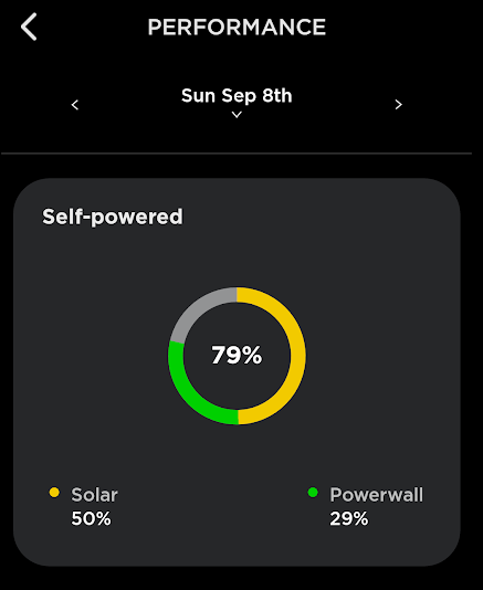
Here’s the “Performance” view for that day, which shows how Self-Powered we were:
Unfortunately this is a more typical day in “Self-Powered mode”:
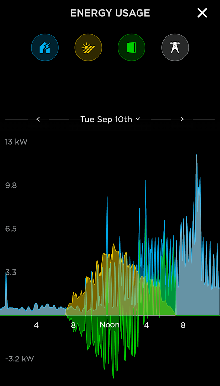
This is a day where we turned on the A/C part of the way through the day. The batteries started out empty, after the sun came up we started alternating charging them and pulling power back out to run the A/C, eventually the sun started setting and we were running the house off of the batteries but what charge we had been able to put into them only lasted until about the time the sun set, then we were back on the grid anyway.
So, lots of topics to still talk about later! But for now, this gives you some information about what we’ve been thinking about and observing for the past month!
